Most Ads Don't Fail Because They're Ugly
Most ads don't fail because they're ugly — they fail because the decision structure never reaches a purchase. We break down a polished 30-second AC ad that didn't convert, and show why production quality and conversion structure are two different things.
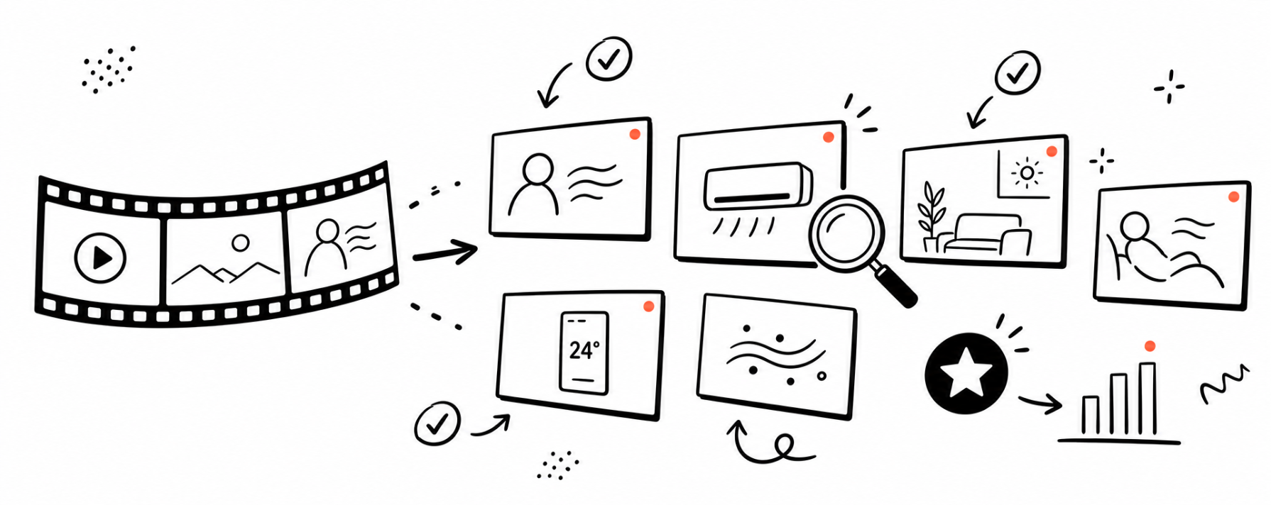
They fail because the decision structure never reaches a purchase.
The Familiar Post-Mortem
Most ad post-mortems sound identical.
CPM looked fine. CTR looked fine.
Purchases didn't happen.
Then the theories start.
The hook was weak. The CTA wasn't clear. Maybe the product wasn't compelling enough.
Everyone has an explanation.
Almost nobody has a model.
Here's the pattern we've seen repeatedly:
The creative wasn't bad.
It was structurally incomplete.
What "Structurally Incomplete" Means
A video can be beautifully shot, professionally edited, and perfectly paced — and still not convert. Because production quality and decision structure are two different things.
Production quality determines how efficiently each moment persuades.
Decision structure determines whether the viewer ever reaches a purchase.
For any Purchase-objective ad, the creative only needs to accomplish three things:
- Stop the scroll (Hook)
- Build belief (Offer + Proof)
- Trigger action (CTA)
Most teams obsess over the first two. The third one gets a brand tagline and a hope.
A Case In Point
We recently broke down a 30-second portable air conditioner ad. Target market: US/EU. Objective: Purchase. Production value was high — vertical 9:16, clean lighting, smooth transitions, multi-room lifestyle shots. Clearly made by a competent team.
↑ The actual 30-second AC ad we broke down
The surprising part:
The ad wasn't missing information. It had plenty of information.
It was missing progression.
For 22 seconds, the video kept proving the product worked. What it never proved was why someone should buy now.
67% of the runtime demonstrated the product brilliantly. The final 26% handed the viewer a brand tagline instead of a purchase trigger.
The result was a brand film running against a conversion objective.
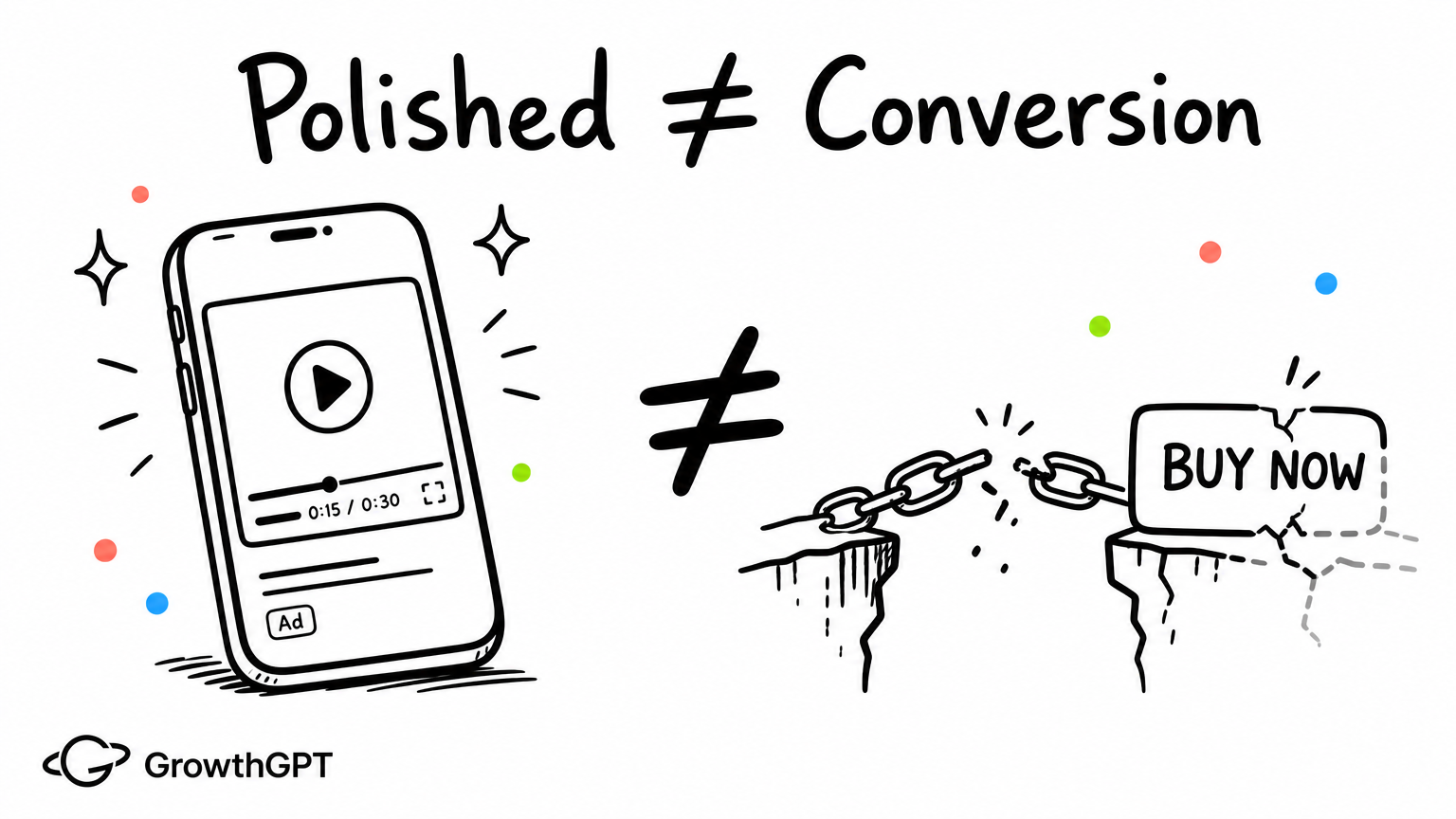
Start With The Decision, Not The Video
Before judging whether a creative "works," the more useful starting point is: what decision is this video supposed to drive?
For this product, the buyer profile is specific:
- Who buys: 25–40 year-old renters in the US/EU. They care about living quality. They're sensitive to installation complexity.
- Why they buy: They want relief from the heat. They like discovering a simpler alternative to traditional AC.
- What stops them: They're not sure how hard installation is. They're skeptical about cooling power. There's no price visible. And they've never heard of this brand.
Once you define the decision, the evaluation changes entirely. The question isn't "does this look good?" — it's "does this resolve those blockers in sequence?"
Scorecard:
| Dimension | Score | What it means |
|---|---|---|
| Hook Strength | 3/5 | Relatable scene, but no instinctive pattern-break. Viewers understand the problem; they don't feel it. |
| Value Prop Delivery | 4/5 | Three selling points demonstrated clearly. "25°C" on screen provides tangible proof. |
| Visual Execution | 4/5 | Clean quality, smooth cuts. Shot density in optimal range for 30s. |
| Platform Fit | 3.5/5 | Vertical, correct length — but pacing feels more "brand film" than native content. |
| CTA Effectiveness | 2.5/5 ⚠️ | Brand tagline where a purchase trigger should be. No price. No urgency. No action command. |
Average: 3.4/5 — Verdict: ⚠️ Needs Revision
The issue isn't that the CTA is terrible.
It's that nothing in the final seconds creates urgency.
The viewer leaves informed. Not activated.
Where The Structure Breaks
Going shot-by-shot makes the fault line obvious. The 30-second video maps to 17 distinct shots:
| Segment | Timecode | Share | Function |
|---|---|---|---|
| HOOK | 0:00–0:02 | 7% | Problem establishment (heat discomfort) |
| DEMO + PROOF | 0:02–0:22 | 67% | Product reveal → setup → activation → airflow proof → multi-room → interface |
| CTA (attempted) | 0:22–0:30 | 26% | Lifestyle recap + brand tagline — no actual call-to-action |
→ See the full 17-shot breakdown with timecodes
Three things stand out:
The best moment happens too early
The "hair blowing in cool air" relief shot is the single most compelling instant in the entire video. It lands at second 9. The remaining 21 seconds never reach that emotional height again.
Two-thirds of the runtime is demonstration — with diminishing returns
The demo section is strong, but roughly 6 seconds repeat proof points already established. After 15 seconds, viewers are in fatigue territory with no new stimulus pulling them forward.
The final third decreases energy
The last 8 seconds show a relaxed woman with a brand tagline. The emotional trajectory goes from "I want that" to "that looks nice" — and "nice" is the opposite of purchase urgency.
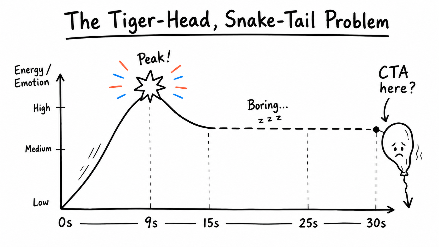
For Purchase objectives, the final seconds should be the second energy peak — not the lowest point. This video's pacing curve is "fast → plateau → fade" when it should be "fast → fast → climax."
One more detail: a spelling error at 0:17 ("livingoms" instead of "living rooms"). Small thing. But for a high-consideration purchase with zero established brand trust, typos actively damage credibility.
Why The Platform Matters
Same video, five platforms, five different outcomes.
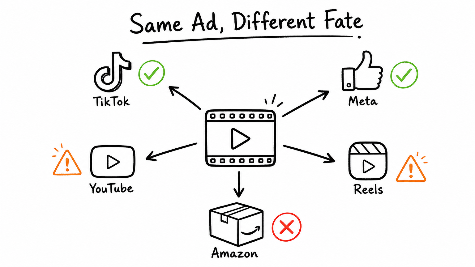
| Platform | Verdict | Key gap |
|---|---|---|
| Meta Reels | ✅ Ready (after fixes) | Fix typo + add 3s CTA end card — visual quality matches the ecosystem |
| Meta Feed | ⚠️ Needs adaptation | 9:16 crops to 4:5 in feed; no captions for sound-off viewers |
| TikTok Spark Ads | ⚠️ Needs restyling | Too polished — feels like an ad, not native content |
| TikTok Shop | ⚠️ Significant rework | Missing price, cart CTA, urgency badge, creator-style delivery |
| YouTube / Google | ❌ Poor fit | 9:16 incompatible with 16:9 requirement; not worth adapting |
Without completing the "trigger action" step, running this against a Purchase objective is likely buying brand impressions at conversion prices.
Four tests to validate the fix direction:
| What you're testing | What you're learning | Metric |
|---|---|---|
| Current hook vs. pattern-break (ice cube time-lapse) | Whether instinct-level interruption lifts attention | 3s view rate |
| Brand tagline close vs. price + countdown + "Shop Now" | Whether explicit action triggers lift conversion | CTR + Purchase CVR |
| Female protagonist vs. male protagonist | Whether creative fatigue is audience-specific | CPA by gender |
| Current polished edit vs. TikTok-native re-edit | Whether platform-native styling reduces acquisition cost | CPM + CPA on TikTok |
How We'd Rebuild It
The obvious fix is "just add a CTA." That's the fastest patch. But if the goal is structurally lower cost-per-purchase, you need more than a patch — you need to redesign the persuasion logic from the buyer's psychology up.
The question to start from: what makes someone physically stop scrolling?
Three directions, each traceable to a specific psychological mechanism:
"The 3AM Wake-Up" — Survival-threat hook
Opening: 3:17 AM on a phone screen. A face drenched in sweat. A soaked pillow outline in the dark.
Why it works: This isn't "understanding" heat — it's re-experiencing it. Sleep deprivation triggers survival-level threat perception. The viewer's body remembers before their brain processes.
Structure: Threat (3s) → Hard cut to same person sleeping under a blanket with AC running → Setup demo → Price + CTA
"The Landlord Can't Say No" — Social powerlessness hook
Opening: Text message screenshot — "Sorry, no drilling allowed." Phone tossed angrily onto the couch.
Why it works: Names the #1 actual purchase blocker for the target audience. The chat-screenshot format lowers ad resistance. The power-shift moment (finding a no-permission workaround) triggers autonomy drive — one of the strongest purchase motivators for 25–35 renters.
"Temperature Race" — Curiosity-gap hook
Opening: "I tested if this $199 AC can cool my apartment from 35°C to 25°C in under 10 minutes."
Why it works: The race format creates natural suspense. A running thermometer provides second-by-second proof no polished brand video can replicate. Creator format matches TikTok/Reels native language exactly.
Lowest production cost: 1 day, $300–$1,000. The shoot IS the content.
→ See all four creative direction briefs with full scripts and budgets
None of these directions came from brainstorming. Each one traces back to a specific decision blocker or psychological trigger identified in the buyer model.
Creatives that can be traced to a mechanism can be tested. Creatives that can be tested can be iterated. That's the difference between inspiration and process.
What This Actually Changes
For years, creative review has been treated like an art critique.
Someone watches. Someone gives an opinion.
The problem is that opinions don't compound.
What compounds is understanding.
Once a team can explain why a creative works — not "I feel like the hook is weak" but "the emotional peak lands at second 9 and the remaining 21 seconds create no new decision value" — it can improve it.
Once it can improve it, it can scale it.
Creative becomes less like inspiration. And more like engineering.
Try It
If you have a video creative you're unsure about — or one that's live but underperforming — you can drop it into GrowthGPT and get the full structural breakdown.
No prep needed. Upload the video, state your objective, and let it work.